Friday, 11 October 2013

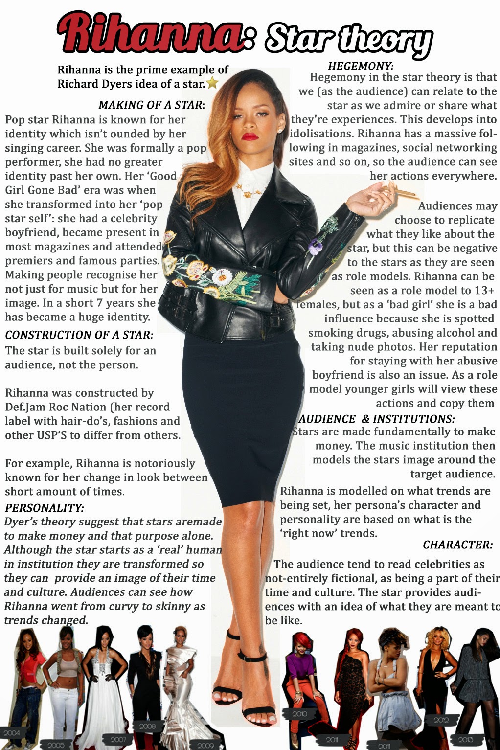
Research into 'Dyer's star theory'

Dyer proposes that:

'A star is an image not a real person that is constructed (as any other aspect of fiction is) out of a range of materials (e.g. advertising, magazines, etc. as well as films/music).'

The theory can be broken into 5 sections:

  1. The making of a start
  2. Constructions
  3. Audience and Institutions
  4. Hegemony (Cultutral Beliefs)
  5. Character & personality
Here is  diagram of Rihanna, who is the perfect of example of somebody who comes under the 'star theory':


Thursday, 10 October 2013

Digipak Moodboard


This is our moodboard regarding our ancillary task. The various images are inspiration for when we get around to creating the album cover/poster. We have decided to stick to a sophisticated appeal, making sure that the rose sticks out within the images as it is significant throughout our music video. Black & White was also important as we felt that it would fit our genre,

Filming footage for picnic & hill/rock/lake (2nd day filming)


Friday, 4 October 2013

Analysis of Digipak (no.2) Beyoncé - Greatest Hits


The second digipak that we are analysing is a limited/platinum edition of Beyoncé's greatest hits. Only 500 copies were on sale when it was distributed in 2009, which proves the rarity of the digipak. The compilation of the album is formed through three of Beyoncé's previous studio albums:
  • Dangerously In Love
  • B'Day
  • I Am...Sasha Fierce
The album consists of 20 songs on disc 1 in addition to another 20 on disc 2. These songs are all of various genre's, which makes it difficult to define Beyoncé's type of music. However, Beyoncé has gained herself an honorific nickname in popular music, especially in the USA where she is labelled as the 'Queen of Pop' & the 'Queen of R&B'. Themes of 'R&B' and 'Pop' are conveyed in regards to her costume and make-up since she has been glamourised to fit the image of a typical popstar. As glamorous as Beyoncé looks in the pictures she also seems to oppose the conventions by having edgy make-up and clothing, which makes her stand out. This represents her R&B side because it depicts her cooler persona, which relates to the recent evolution of R&B music that has blended in with rap. A genre that is stereotypically viewed to be listened to by a younger, in-fashion type of audience.

One element that stands out in terms of representation are the colours used throughout the digipak. black and gold are the main two colours used regarding all parts of the digipak, which symbolises the importance of Beyoncé's 'greatest hits'. This also corresponds with the titles she has gained which have been mentioned in the paragraph above, these being:

  • 'Princess of Pop'
  • 'Queen of Pop Music'
  • 'Queen of R&B'
The fact that the images of Beyoncé are black and white can also represent her timeless mark on the music industry. I feel that these images are made black and white to connote the simplicity of her beauty and the fact that she is considered one of the greatest musicians in this day of age. The costumes do not make the images seem to sophisticated as they are modern and 'urbanised' to fit the R&B element to her music. 

The narrative throughout this digipak is to display the importance of Beyoncé's 'greatest hits', hence the gold and black colouring as they represent bold importance regarding her music within the industry. Her alter-ego 'Sasha Fierce' is the main focus in terms of the images of her, since 'Sasha Fierce' is a lot edgier and is well regarded amongst fans of Beyoncé, it would be beneficial to include her within the digipak. The fact that the discs are made to look like vinyl records also tell a lot about Beyoncé's significance within the music industry. The balck and gold colouring also blends well with the vinyl record and connotes a story that Beyoncé's music will also be remembered in history.

In conclusion I feel that this digipak is a good example of what should inspire our own. The black and white colouring is  a feature that we feel would be benficial to include, in addition to the simplicity of how the images are layes out and the fact that there aren't many effects used to manipulate the way certain things appear. 

Tuesday, 1 October 2013

Analysis of Digipak (no.1) - Katy Perry - Teenage Dream


The first digipak we have decided to analyse is Katy Perry - Teenage Dream. 'Teenage Dream' is Perry's third studio album and was released August 24, 2010. It recieved a mixed reception from critics despite making it to number 1 in the US Billboard Charts and being commercially successful worldwide.

Within Perry's album there is a variety of genre's in her songs, but the main one is seen as pop. This relates back to the digipak because the images are represented as sweet and bubbly, which indicates that the target audience are females and that the genre is fun-loving, easy to dance to and cheesy. This relates back to the pop genre.

A clear narrative to this digipak is parallel to the film 'Alice In Wonderland'. This is due to the fact that Perry goes into a different world that is not shown or indicated through her past studio albums. We believe that her new 'candy world' depicts that she is now in a brand new world of fame, fortune and success. A specific scene within Alice In Wonderland that correlates with the them of 'Teenage Dream' is the Mad Hatter's tea party. This comes down to Perry's costume designs and the fact that general concept is very adventurous and fits the 'wonderland' image.

Throughout the digipak there is a clear theme of 'candy', or 'sweets' as they are more commonly known as in the UK. This is firstly shown from the front cover of Katy Perry lying naked on a cotton candy cloud. This depicts her sweet personality and childish nature, whilst her being naked shows her more promiscuous side. This is further reinforced by the fact that she is wearing a 'paper cupcake mould' which is designed to show off her body parts in a sexual manner. The inside of the digipak displays Perry wearing different crowns in two separate images. One being a Tiara, which is formed using a gigantic gummy worm as the basis, and lollipops creating the general design where jewels would have been placed. The Tiara connotes Perry's 'princess' type of personality as they are represented as younger, playful and refreshing types of people.  The other type of head dress is a crown, which depicts her royalty in addition to her stern side, which gives assumption towards how she has already made it in the music industry. The last image that is shown on the back cover is an image of Perry with a three-tiered cake posing as a hat. This looks similarly to a stereotypical chef hat, along with the stack of cakes that surround her symbolising dirty dishes. The ideology behind this is that she controls every aspect of this 'candy world' and has to work hard to achieve her status in the music industry. Lastly, there are two discs included in the digipak; one resembles a doughnut, whilst the other has the design of a candy cane. These concepts resemble 'treats' for the people who are buying the CD's.

The main target audience are young females in-between the ages of 10-25 because they can relate to the character of Katy Perry being a 'Princess' and a 'Queen'. One song also unites and enforces the message of 'girl power', which is 'Californian Gurls'. The promiscuous nature of her imagery within videos and underline of message regarding her music may appeal to a male audience between the ages of 14-25.